Our survey builder is keeping up with your requests
Zurvey.io’s survey builder section has reliably served users for years, and we want it to stay that way - so its development never stops. Here are the latest new features. What are you going to try first?
The new features include updates to scale questions, inserting images or videos into your survey in new ways, and various finetunes that improve the look and feel of the survey on the whole.
Several new options for scale questions

-
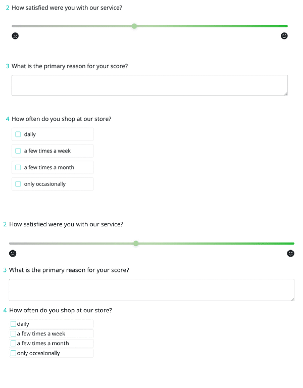
Colored slider
There is now a new, much more intuitive slider bar available, where colors indicate positive and negative directions. Respondents will be able to use these even without having read any labels. The scale is based on gradients calculated from color coordinates, which helps respondents signal their preference or opinion on any topic. A default color is calculated for the minimum, center and maximum points of the scale, but you can overrule these while building your survey, and add custom colors instead. Neat, right?
-
Select icons as labels
Another thing that’s changed for scale questions is that you can now select icons as labels for them. This will make scale questions more visually appealing, while answering these questions also becomes much more intuitive for respondents. It should significantly decrease the bias attached to either choice. Icon types and styles (solid, light, normal) can be changed separately for minimum and maximum labels.
-
Slider with decimal values
Yet another option for slider scale questions is that you can now convert slider values into decimals. You can use a scale with a precision of one decimal (0.0 -» 100 data points) or two decimals (0.00 -» 1000 data points). If you want to spread out ratings a bit more, this is a great option: you can get 100 data points even if you’re not using a scale from 1 to 100. Please be aware that the converted values will be saved and stored as decimals too.
-
An extra tooltip to capture more feedback
Do your survey respondents sometimes leave sliders unchanged? If you want to make sure they only progress to the next page of the survey if they’ve interacted with the slider scale question, you can do that now. By activating this function, the slider will not have a default value saved (like it does when this function is switched off). Therefore, if the question is marked as required, respondents will need to interact with the question and manually adjust the slider in order to proceed with the survey.
-
Hide value of slider type scale
To make sure that respondents remain unbiased, you can now choose to hide the values of the slider from them, both during interaction with the scale element and after selection. This means they won't know the specific value being selected when moving the slider node along the bar. Enable this feature by switching on the ‘Hide values’ option among the question’s settings.
Insert images and videos with more freedom
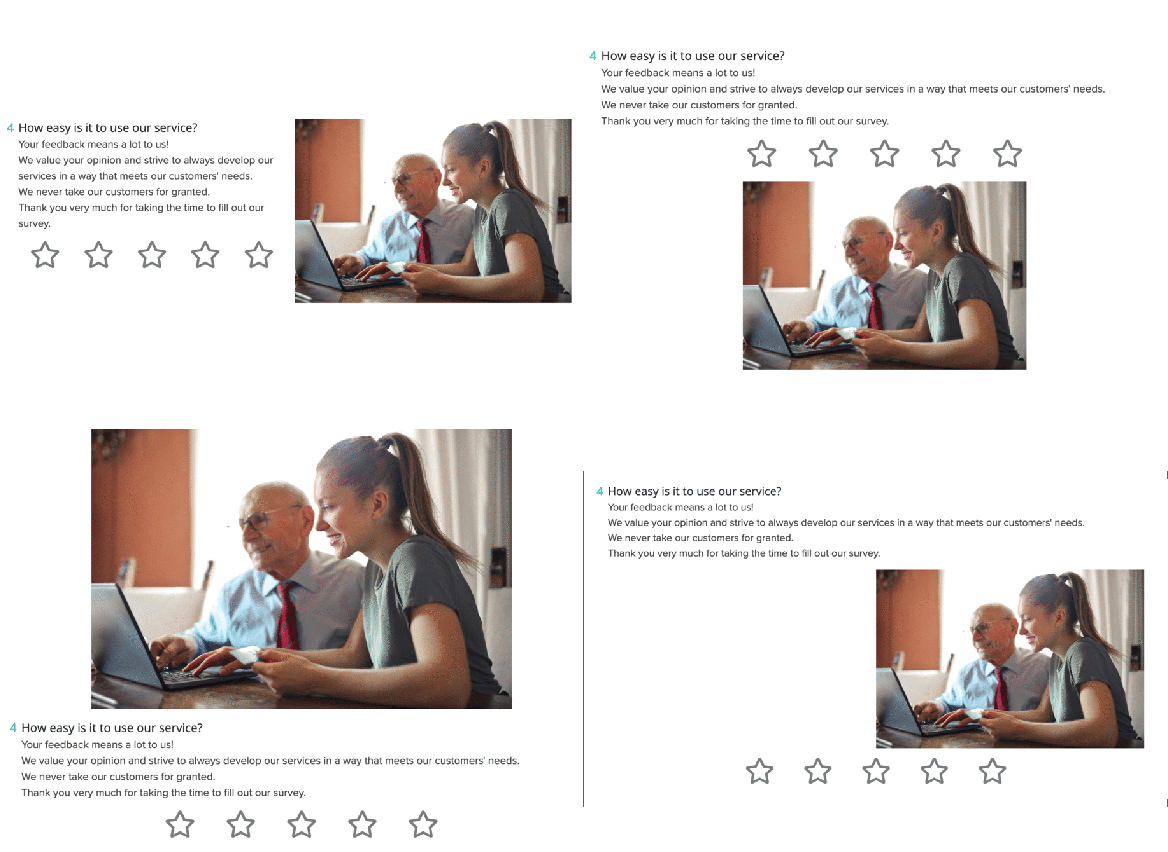
We’ve revisited the media insertion and visualization functionality on our question elements. From now on, you can change both the position and the size of uploaded images or videos at each question. For example, if you would like to create an on brand look with stock photos, it makes the end result much more streamlined. Images can add a uniform look and feel to the survey - you could even use them as a header.

How does that work? On every question element (including explanation texts), there is an option on the top to insert an image or video. Clicking on ‘image’, you can upload files, while a YouTube link can be added by clicking on the video option. Once the image is uploaded, you can choose from multiple positions and sizes, including a special option called “As Icon”, when the image is positioned before the question element and aligned in one row. Besides vertical layout options, there is now a possibility to position the images next to the question or explanation text. To make sure you’re happy with the layout, don’t forget to check the preview!

Dropdown questions finetuned
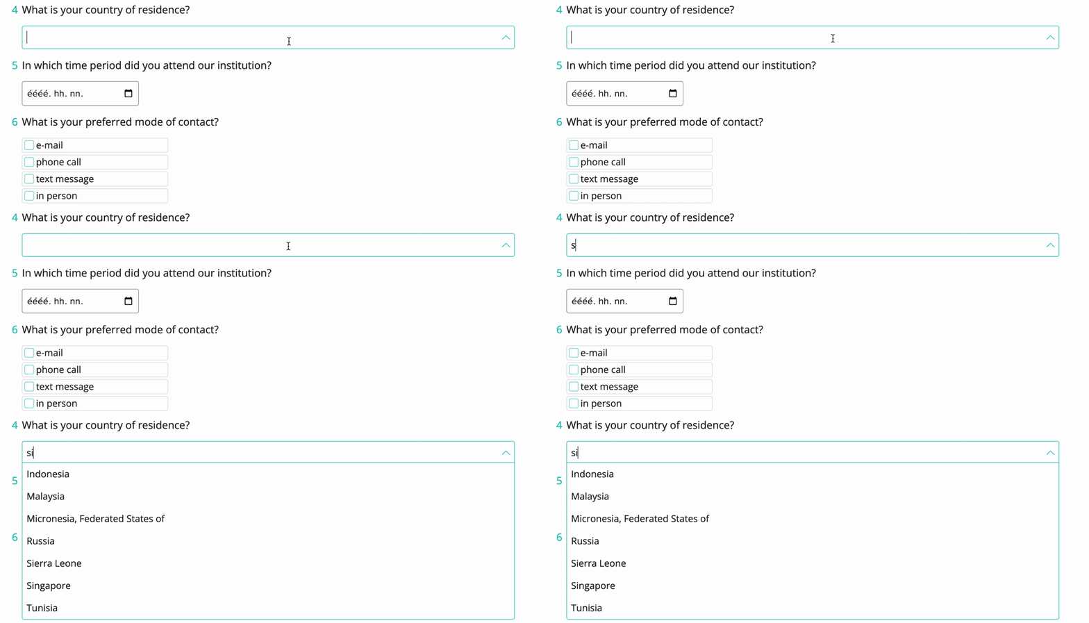
No need to copy and paste thousands of dropdown options anymore! From now, you can simply upload them in the survey editor in an .xlsx file. (This should only contain the options without a header, and the maximum number of options is 2000.) Once you’ve uploaded the options, you can still make modifications: options can be removed one by one, or en masse, too.
A ‘Show options only for search’ switch has also been added. If this is enabled, dropdown options only appear when at least two characters have been typed in the input box. This can come handy when the complete dropdown list would be too long to display, or you don’t want to display all options due to legal concerns.

New layout options
Wouldn’t you like to decrease scrolling time for your respondents? When they feel the survey takes less time, you are much more likely to get answers to all your questions. So, we’ve just introduced options to decrease the margin between question elements. From now on, the layout we’d already had is called spacious, and serves as default. The two new ones are cozy and compact, each decreasing margins between elements at a different ratio.

Customize your browser tabs & tags
It is now possible to use your company logo as a favicon in browser windows, while the title appearing at the top of the browser tab can also inherit the survey title if you want it to. These small changes make the end result just a little bit more neat and tidy, but the devil often lies in the details, right?
If you would like to know more details about these new features, make sure to contact your Customer Success Manager. Or, if you're not a Zurvey.io user yet, go ahead and book a demo to see the features in action.
Share:


